

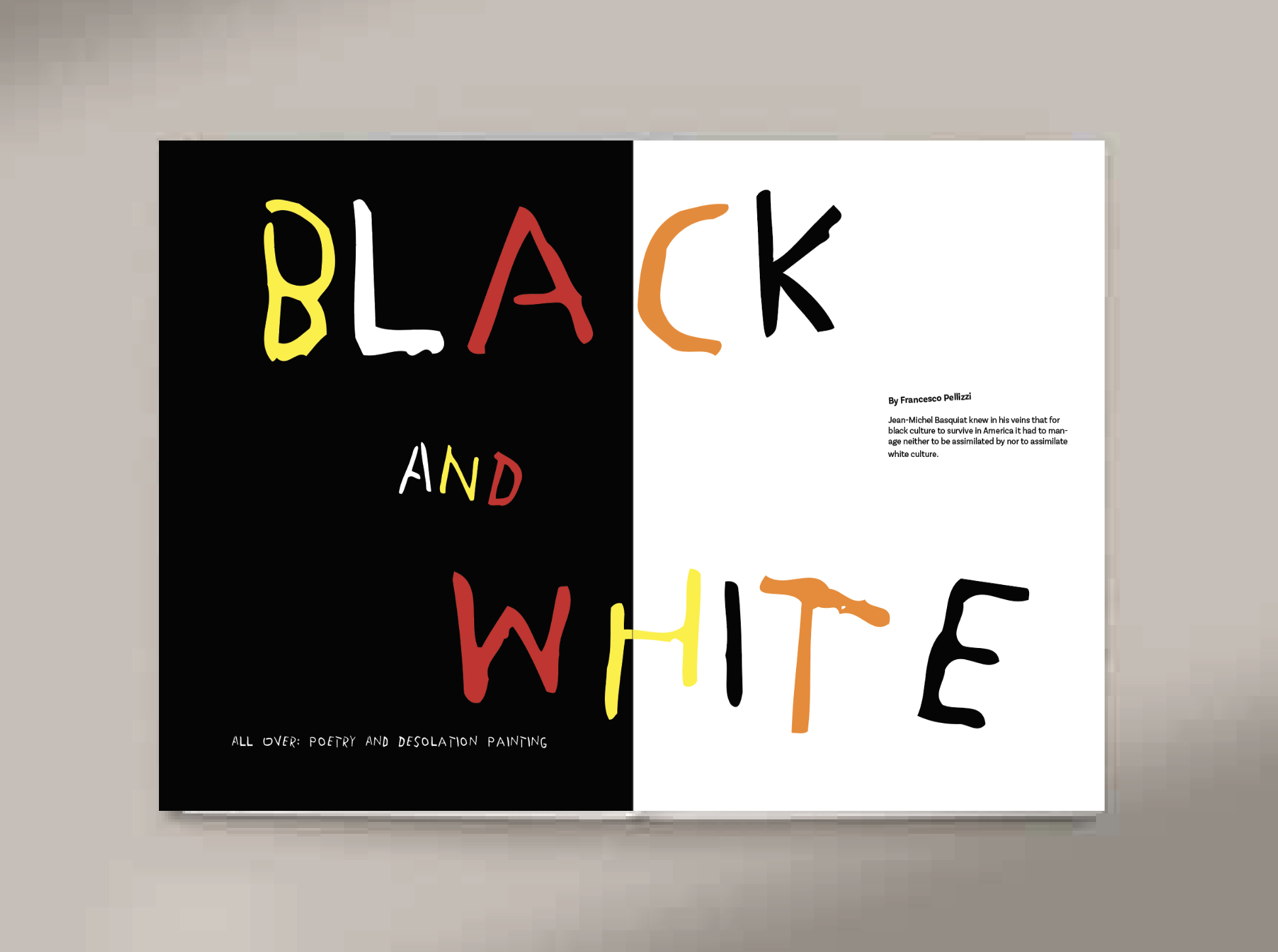
Black and White
Magazine Design

tools
Adobe Illustrator, Adobe InDesign,
tEAM
Solo


For my black and white magazine spread, my ideation process was driven by a balance of expressive creativity and structured design. I began by sketching multiple layout concepts, experimenting with different compositions, text hierarchy, and varying title sizes to determine the most dynamic yet readable arrangement. These initial sketches allowed me to explore diverse typographic treatments while ensuring the design remained engaging and cohesive.
Ideation

key Takeaways
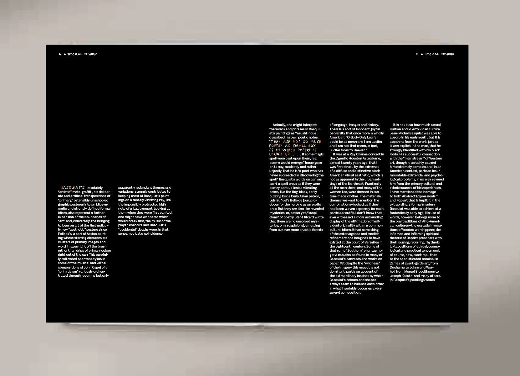
This project taught me the power of typography as a storytelling tool, allowing me to convey the depth and emotion of Francesco Pellizzi’s excerpt through carefully considered design choices. By focusing on bold contrasts and refined typography, I learned how to create visually striking layouts that enhance the reader’s engagement while maintaining readability. Developing a cohesive visual style pushed me to think critically about editorial design principles, including hierarchy, spacing, and composition. Additionally, this project reinforced the importance of concept-driven design, ensuring that every element— from typefaces to layout choices— aligned with the tone and themes of the text.
Timeline
September-October (1 Month)
Role
Lead Designer
Project Overview
For this project, I designed typography-focused magazine spreads inspired by an excerpt from Black and White All Over: Poetry and Desolation Painting by Francesco Pellizzi. Drawing from the text's tone and themes, I developed a cohesive visual style that reflects its depth and emotion. The spreads include an impactful opening layout, where bold contrasts and refined typography emphasize the essence of the excerpt while showcasing my skills in editorial design and conceptual storytelling.
Goal of project
The goal of my project was to create a visually compelling and engaging design inspired by the Basquiat style. I focused on balancing a playful, stylized aesthetic with readability and consistency to ensure the text remained both impactful and accessible.
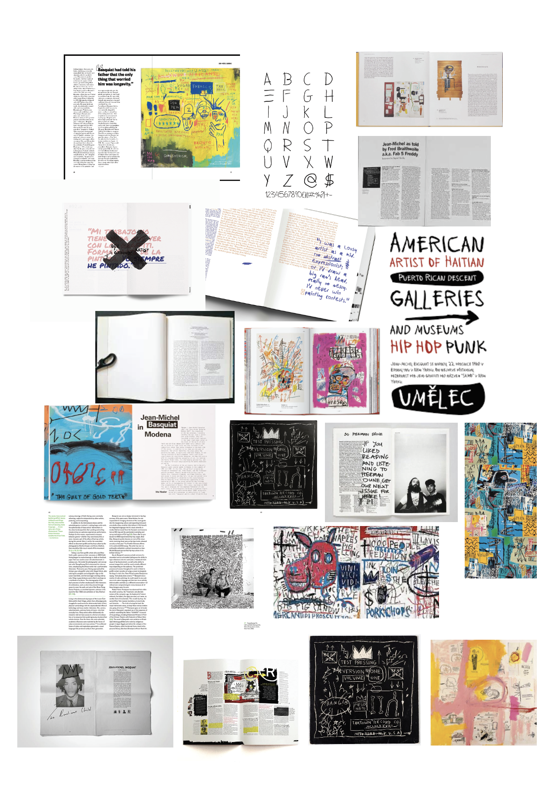
To refine my direction, I developed a mood board incorporating Basquiat’s signature style—his raw, spontaneous mark-making, layered text, and high-contrast elements. This visual reference helped guide my approach, influencing the spread’s overall aesthetic and typographic choices. By analyzing his works and translating their energy into my design, I ensured the final layout felt authentic to his artistic language while maintaining readability and consistency.
I experimented with various layouts, starting with black-and-white sketches to establish composition and hierarchy. I then introduced color to enhance visual appeal and readability. Different typography arrangements were tested to find the best balance between clarity and aesthetics, ensuring the text complemented the illustrations without overwhelming them. Through this iterative process, I refined the design to create an engaging and well-structured guide.


