Guide for common wealth cocktail
Poster Design

tools
Adobe Illustrator, Adobe InDesign,

tEAM
Solo


mOODBOARD
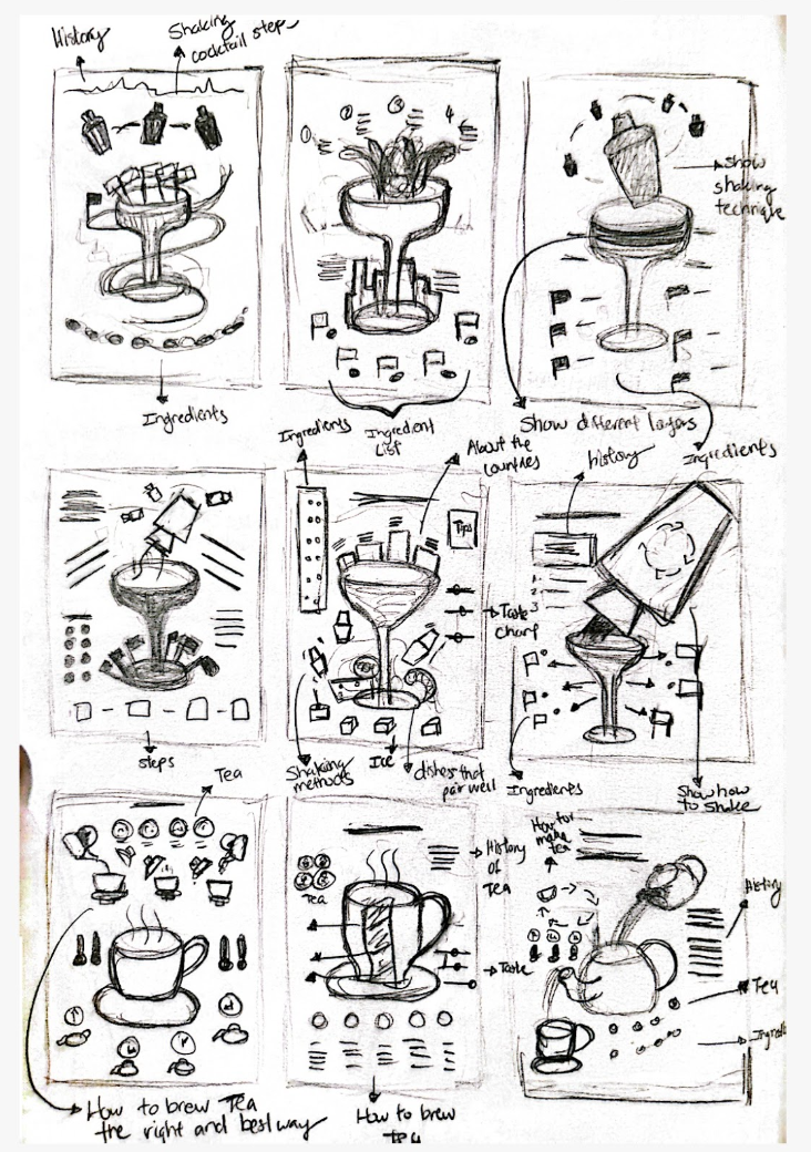
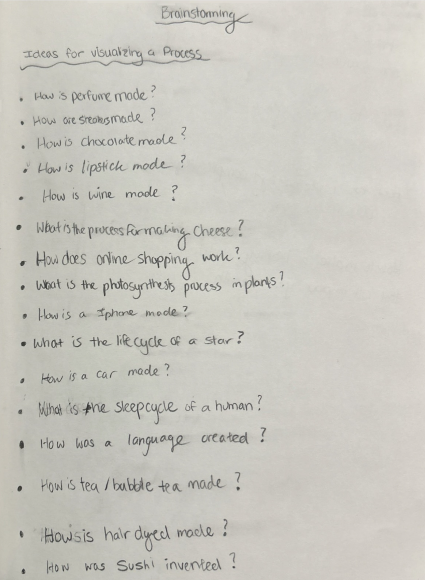
INITIAL BRAINSTORMING
key Takeaways
Through this project, I learned the importance of balancing aesthetic appeal with clear communication, ensuring that the visuals remained engaging while effectively guiding the viewer. Experimenting with hand-drawn illustrations and watercolor markers reinforced how tactile, organic elements can enhance digital design, adding warmth and personality. I also gained insight into the significance of typography choices, as the handwritten font played a crucial role in maintaining a cohesive, handmade aesthetic. Additionally, focusing on the technical accuracy of the cocktail-making process taught me how to integrate functionality with creativity, making the final design both informative and visually compelling.
Timeline
October (2.5 Weeks)
Role
Lead Designer
Project Overview
This project involved selecting a topic and designing a step-by-step instructional poster. I chose to create a guide on making the Commonwealth cocktail, known for its complexity and extensive list of ingredients. The goal was to present clear, engaging, and visually appealing instructions that effectively communicate the process while maintaining an organized and professional layout. Through careful design choices, including layout experimentation and color selection, the final poster balances aesthetics with functionality, making an intricate cocktail recipe more accessible to viewers.
Layout and type Exploration
In developing my guide to making the Commonwealth cocktail, I explored multiple layouts and experimented with various color backgrounds to achieve the most effective design. My focus was on balancing visual appeal with clarity, ensuring that the arrangement of graphics and text not only provided an engaging aesthetic but also enhanced readability and realism. Through iterative design testing, I refined the composition to create a visually compelling and informative guide that effectively captures the essence of the cocktail while maintaining a professional and engaging presentation.

The goal of this project was to create an engaging and visually appealing step-by-step guide to making the Commonwealth cocktail. I aimed for a lighthearted, illustrative style that felt fun yet informative. To achieve this, I hand-drew all elements and used watercolor markers for a vibrant, artistic touch. A handwritten, marker-like font was chosen to complement the handmade aesthetic and create a cohesive design. Additionally, I focused on highlighting the ideal technique for shaking the cocktail, ensuring both accuracy and visual appeal in the final composition.